Choosing Art for the Bedroom
A bedroom is a personal place to live with a painting. You might want something that settles the room, or a work with enough movement and depth to hold your attention each morning. Begin with the painting you feel drawn to, then consider how its proportions and colours sit within the space.
Light, colour and atmosphere
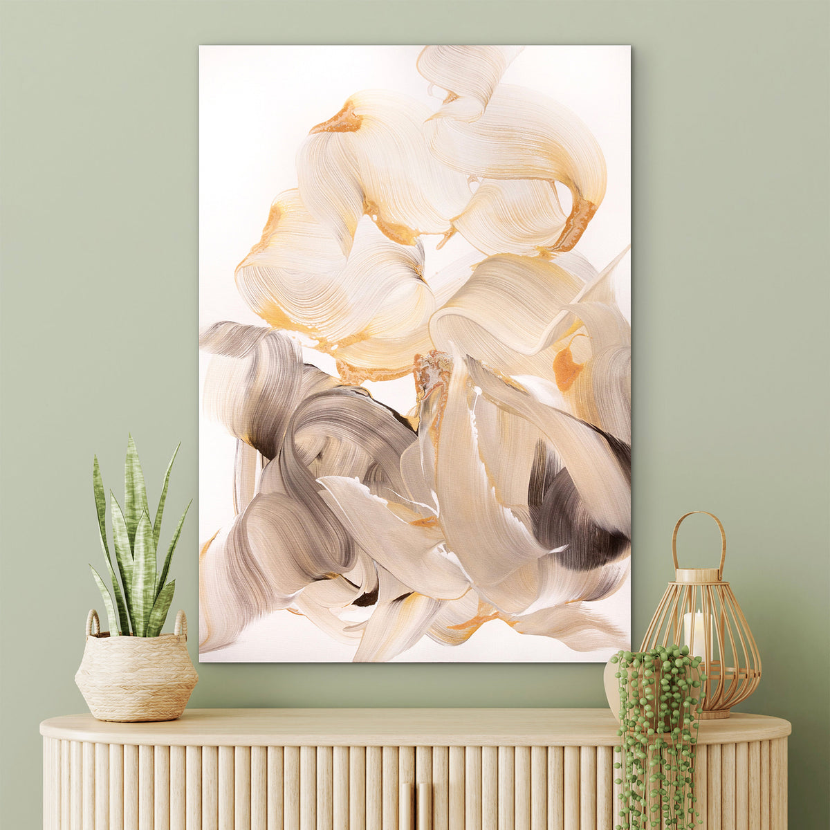
Pale whites and silver grey can bring stillness without leaving a room feeling empty. Silver Spring takes this quieter direction, with faint blush and darker accents giving the light surface depth.
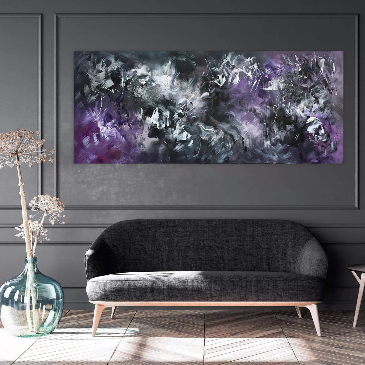
For a longer, more atmospheric composition, Beautiful Dream brings lilac, violet and charcoal into a wide, low canvas. Its deeper passages give it a moodier presence than an entirely pale painting.
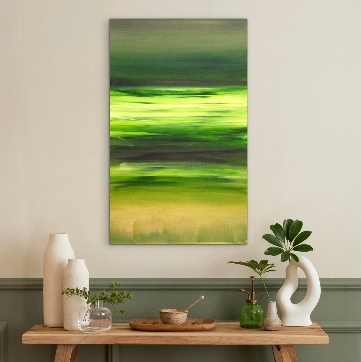
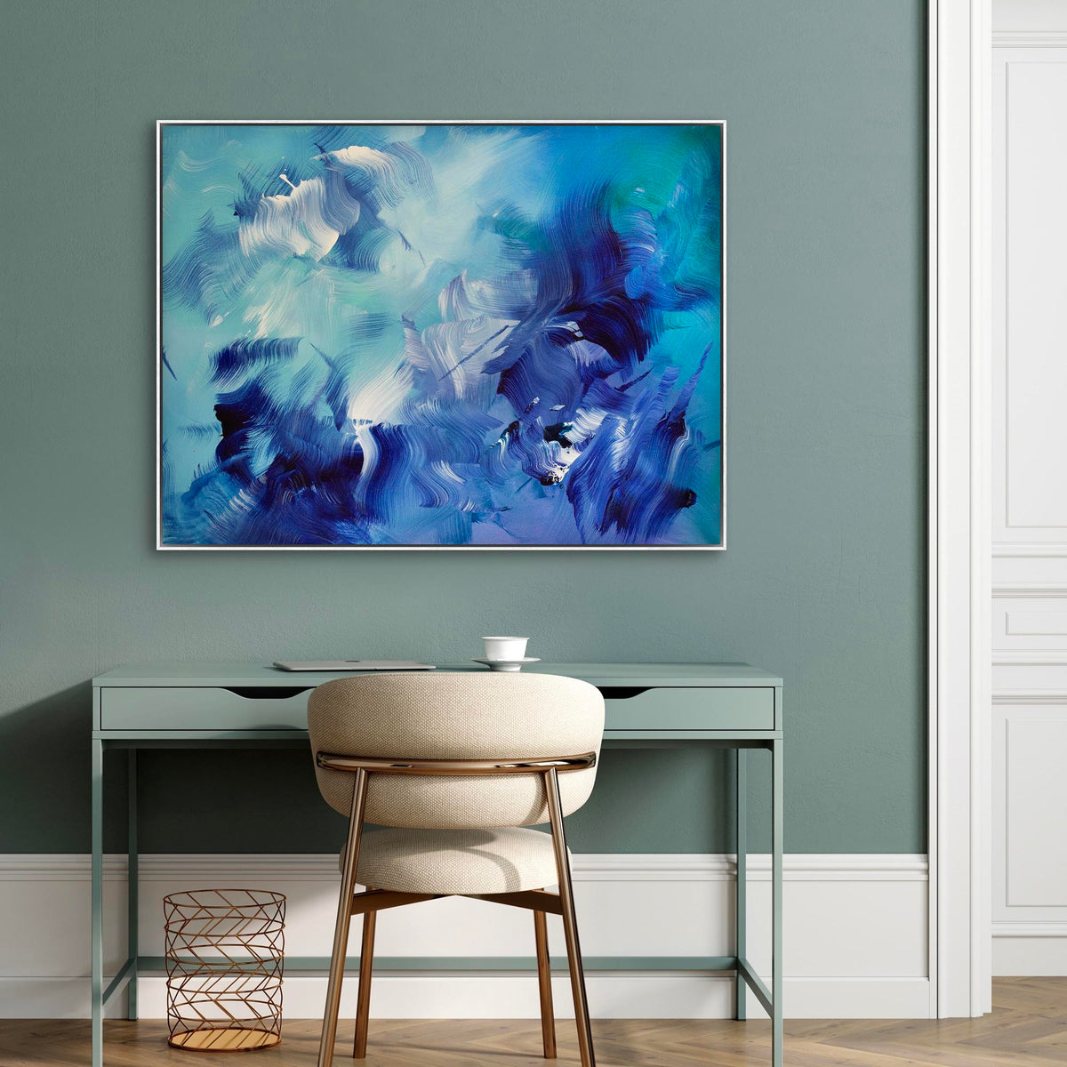
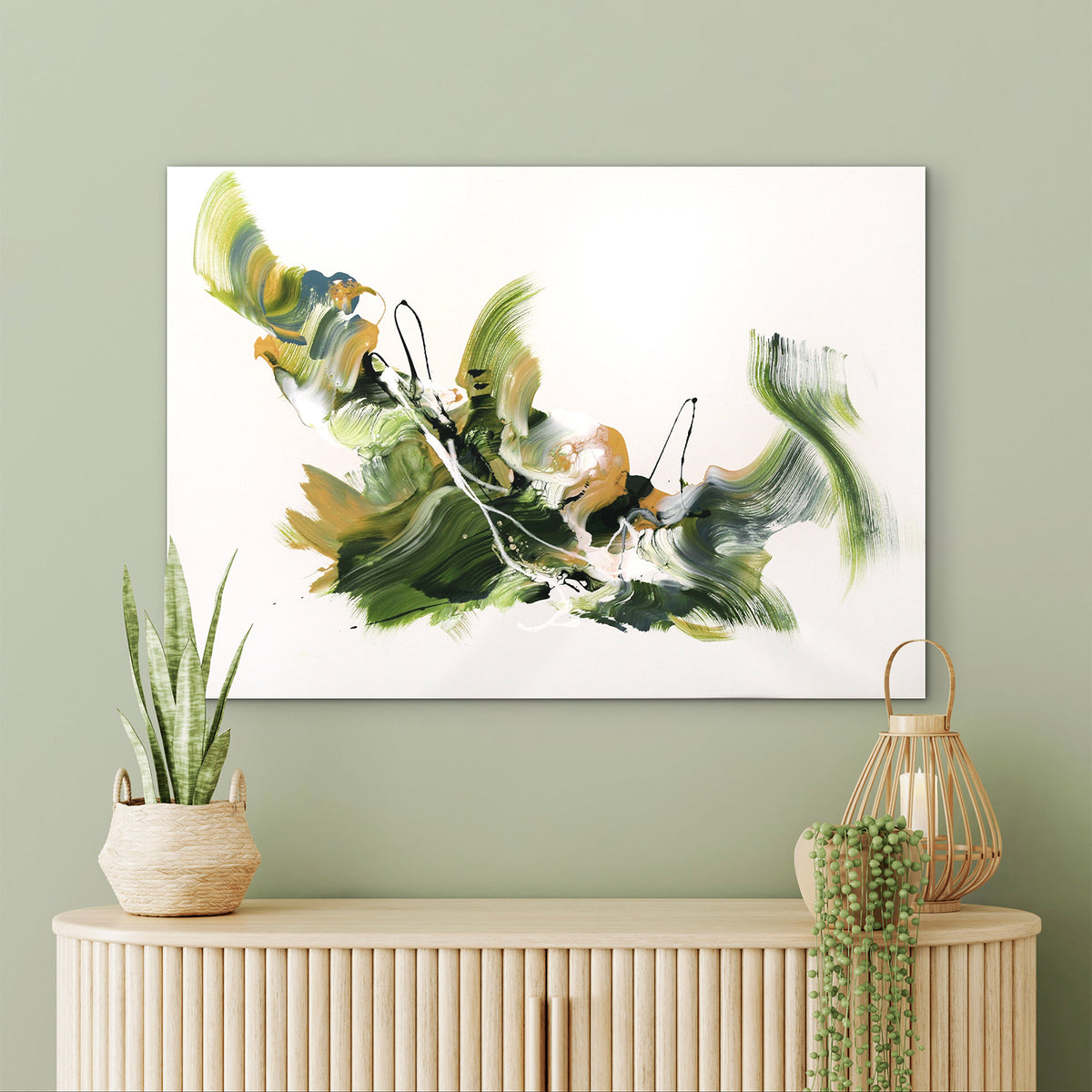
Green offers another kind of calm. In Held by Pale Light, forest green and olive move across warm white, with ochre adding warmth. The selection below also includes blue, soft gold and warmer rose tones, allowing you to find a mood that feels your own.
Finding the right proportions
Above a headboard, consider both the painting’s width and the height available between the bed and ceiling. A horizontal work can follow the line of the furniture; an upright or square painting may find a more natural place on a wall beside the bed or above a chest of drawers.
Measure the wall and mark the painting’s width and height with removable paper. Interior photographs suggest atmosphere; the listed artwork dimensions show the actual scale. A painting can share colours with the room without matching every fabric or finish.
A little guidance from the studio
If you would welcome another eye, send us a photograph of your wall, its measurements and any paintings you are considering. We can help you compare their proportions, palette and presence.