The journal / Art in interiors
Colour beyond
trends.
A painting can bring an interior into focus without following the colour of the year. The right work introduces rhythm, texture and character, and gives a room something personal.
From quiet greens and softened neutrals to confident reds and warm golds, colour in original abstract art becomes more interesting when it is chosen to live with, not simply to match.

01 / A starting point
Should you choose the painting or the room's colours first?
Either approach can work. If the room is already furnished, look for a painting that brings in something it is missing. This could be warmth in a cool space, movement against clean architectural lines, or a single unexpected colour.
If you are decorating from the beginning, the artwork can lead the scheme. Borrow one or two colours for upholstery, ceramics or textiles rather than repeating every shade. This gives the painting room to keep its own identity.
The most considered interiors often feel connected without being completely coordinated.

02 / A confident contrast
Can bold abstract art work in a neutral room?
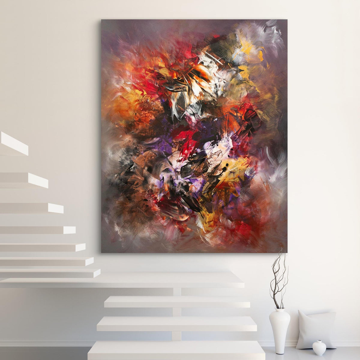
Yes. Neutral walls and simple furnishings can be an ideal backdrop for an expressive painting. Strong colour is easier to appreciate when it is not competing with busy patterns or crowded shelves.
The Warmth Within brings crimson, black and white together in free, energetic movement. In a room of warm whites, timber or soft grey, the contrast can feel deliberate rather than overwhelming.
Balance matters more than colour matching. Give the work space around it and let the rest of the room remain quiet.
03 / Softly layered colour
How do you add colour without making a room feel busy?
Colour does not have to be intense to leave an impression. Muted hues can introduce depth and gentle variation alongside stone, linen, plaster and natural timber.
Held by Pale Light moves through pale green, misted grey and warm white. Its layered surface offers details to discover up close while retaining a calm presence from across the room.
Look at the transitions between tones and the artist's marks rather than choosing by one shade alone. This is where an original painted surface can be especially rewarding.


04 / Finding a connection
Should abstract art match the furniture?
Not exactly. An identical palette can make a room feel too planned. Art can share the warmth of a space, pick up a small accent or provide a different hue entirely.
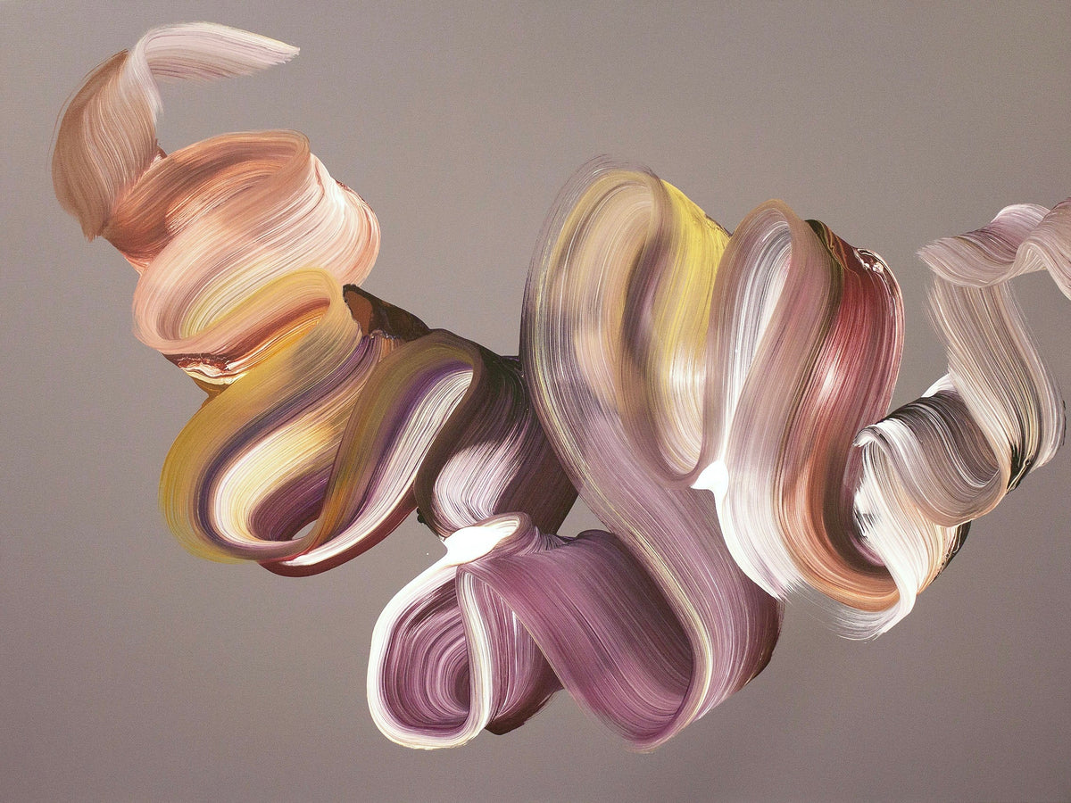
The purple and pink layers of Veil Of Dreams sit comfortably beside pale furnishings. A related tone elsewhere in the room may create continuity, but it is not essential.
Consider the relationship between the artwork, the materials nearby and the available wall space. The whole composition matters more than any single colour.
05 / The role of light
Why does lighting change how abstract art looks?
Daylight and artificial light can make the same painting appear different. A pale colour may look cooler in northern light, while warm evening lighting can deepen reds, pinks and earthy tones. Brushwork and texture also become more visible as light moves across the surface.
Consider the room at different times of day. Avoid strong direct sunlight and damp locations. If you choose picture lighting, aim for even illumination without glare.
Photographs are helpful for understanding a composition, but screens may reproduce colours differently from the original. The studio can provide additional details if you are comparing paintings.
06 / Scale and space
Does the size of a painting affect the impact of its colour?
Very much so. A vivid red might feel like an accent in a smaller painting and become the defining feature of a wall in a much larger work. Shape, orientation and surrounding space change how the whole palette is experienced.
Always check the artwork's exact dimensions before deciding. An interior photograph may suggest how a painting feels in a room, but it does not replace measuring the wall and checking the real canvas size.
For a fuller guide to proportion and positioning, read how to choose abstract art for your home.
07 / From the studio
How does Paresh Nrshinga use colour?
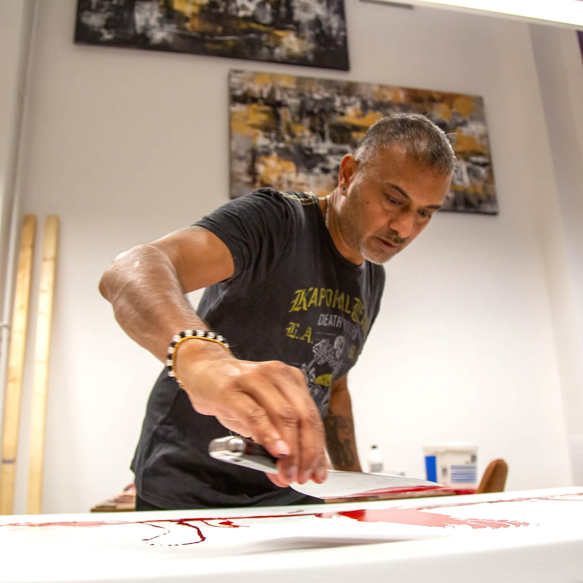
Paresh Nrshinga FRSA is a London-based contemporary abstract artist working in acrylic on canvas. His original paintings range from softly atmospheric compositions to bold gestures and layered movement.
Rather than treating colour as a fixed formula, he explores how marks, contrasts and layers work together. It is why two paintings with similar palettes can feel entirely different.
Looking at the full composition and its close-up details gives a better sense of the work than choosing solely from a colour filter.
08 / Living with art
What is the best colour for an abstract painting at home?
There is no universal answer. A painting needs to interest the person living with it. Some collectors want a strong, expressive centrepiece; others are drawn to restrained tones they notice more slowly.
Choose an original work that keeps your attention. If you have a particular room or palette in mind, browse the collection of original abstract paintings or contact the studio for guidance.
A final thought
Let the painting lead.
Colour trends come and go. Original art stays interesting when it says something to you, not when it follows a prescribed scheme. Find a painting you genuinely enjoy and allow the room to develop around it.
Explore original paintings →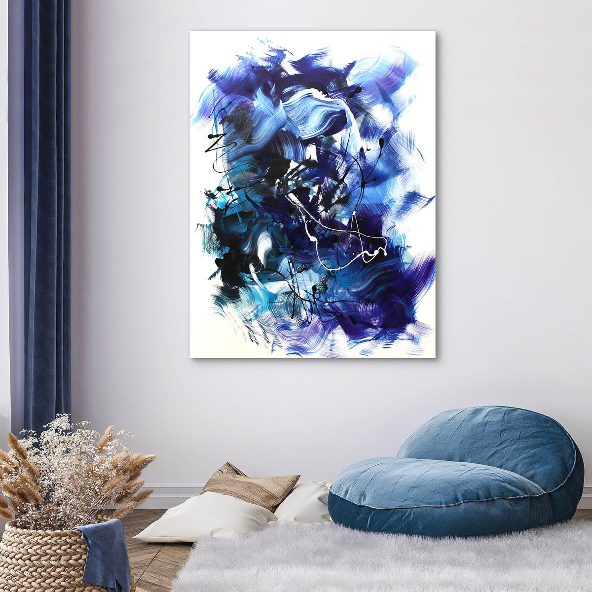
Share:
Large Abstract Art | The Presence of an Original Painting
Choosing Abstract Art for Your Home | A Practical Guide