The journal / Pink and teal
Colour in
conversation.
Pink and teal may seem like an unexpected pairing. One brings warmth, the other a cooler depth. Together they can create a painting that feels expressive, layered and entirely individual.
In original abstract art, colour is never just a swatch. Its character comes from the artist's gesture, the light between layers and the relationship of one shade to another.

01 / An unexpected pairing
Why do pink and teal work so well together in abstract art?
Pink and teal sit in different parts of the colour spectrum, which gives them a natural sense of contrast. Warm pink can feel more prominent beside cooler teal, while teal gains depth when it meets rose, magenta or softer neutral areas.
How they work together depends on much more than two colour names. A pale blush and deep turquoise create a different impression from vivid fuchsia and bright aqua. The proportion of each colour, the painted marks and the spaces between them all matter.
That relationship is what makes the pairing interesting in original abstract paintings. Rather than making a fixed statement, the colours can suggest both movement and stillness within one composition.
02 / The work itself
Can one original painting hold both warmth and coolness?
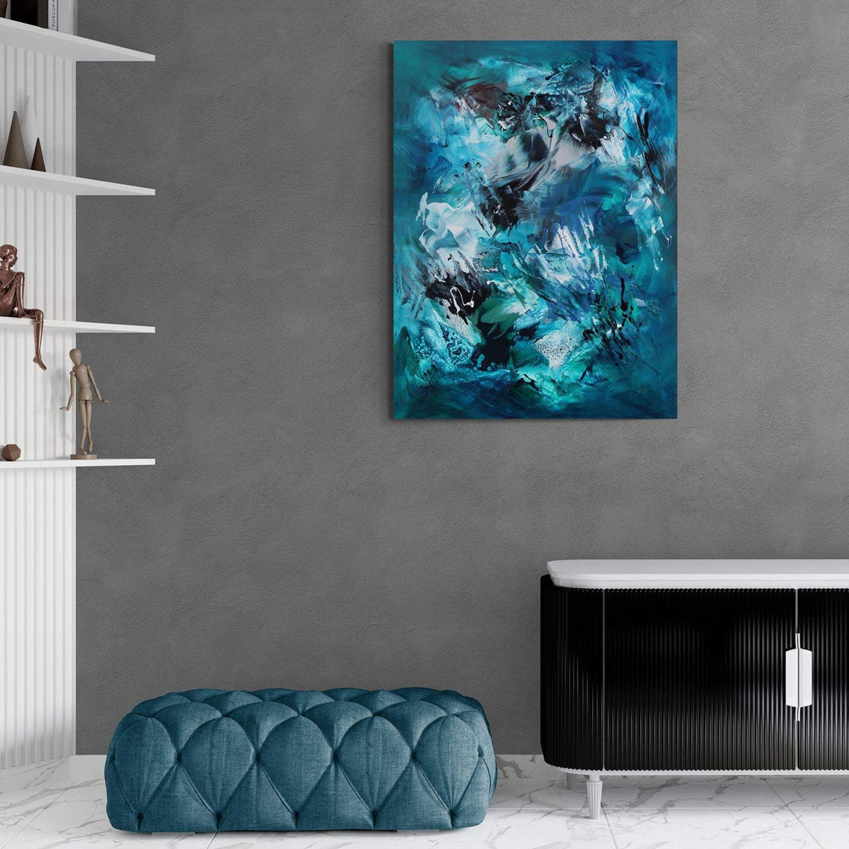
Waterfall brings green, pink and teal into a fluid composition. The colours move alongside one another, sometimes meeting directly and sometimes unfolding in softer transitions.
The painting suggests a sense of depth and changing movement without describing a literal landscape. Seen across a room, the cooler tones form a strong foundation. Closer to the surface, pink becomes part of the rhythm rather than a separate decorative accent.
That balance can work beautifully in a home where you want colour to feel present without overwhelming the room. The painting is the starting point; the surrounding interior does not need to reproduce its entire palette.

03 / Beyond one shade
Is pink abstract art always soft or romantic?
Not at all. Pink can range from pale blush and muted rose to saturated magenta and crimson-leaning tones. Its impression changes with the surrounding colours and the way the artist uses it.
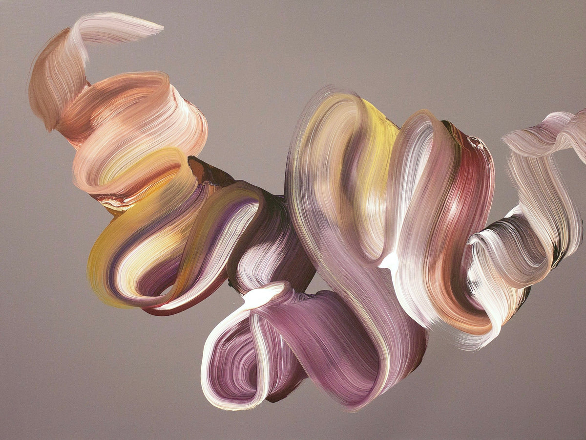
Violets and Pink combines rich violet, blush pink and soft white in layered, expressive gestures. There is a delicate quality in the composition, but the movement gives the work structure and energy.
Pink does not have to carry a single meaning or belong to one kind of room. It can be delicate, confident, atmospheric or playful, depending on the painting itself.
04 / A more atmospheric mood
How can purple and pink create depth without strong contrast?
Strong colour does not always require sharp boundaries. Layers of related tones can create depth through subtle transitions, allowing the eye to move gradually rather than jumping from one area to another.
Veil Of Dreams brings purple, pink and white into sweeping, translucent passages. The composition has a quiet sense of movement, with softer areas giving the more expressive marks room to breathe.
This approach can sit naturally with timber, linen and understated furnishings. An original painting can have presence through its detail and individual character, even when its palette is relatively gentle.


05 / The cooler counterpoint
What does teal bring to a pink and teal colour scheme?
Teal can introduce a deeper, cooler element to a colourful interior. Depending on the shade, it may lean more towards blue or green, which gives it a wide range of possibilities alongside warmer tones.
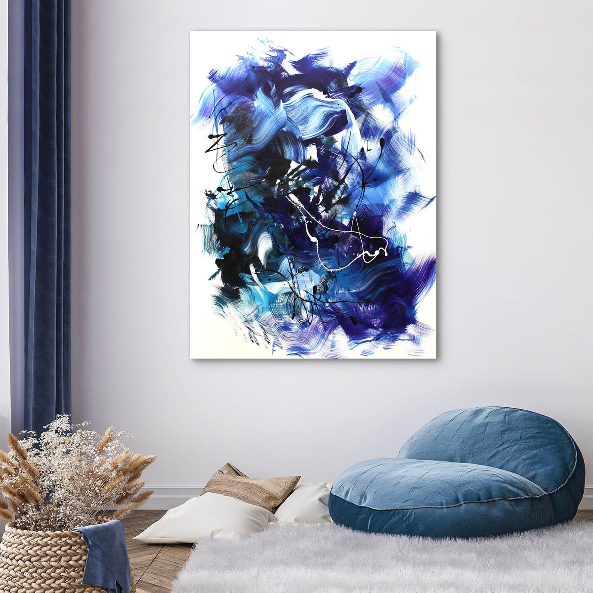
Aqua Dreamscape explores blue, teal and turquoise in a particularly wide, fluid composition. It does not contain pink, but it shows how richly layered the cooler part of the pairing can be in its own right.
If you are considering pink and teal for a room, think about whether one colour will lead and the other will provide a smaller accent. They do not need equal weight to work together.
06 / A personal response
Can magenta and deeper pink feel sophisticated?
Yes. Sophistication does not come from removing colour. It comes from how the shades are balanced, the movement in the painting and the space allowed around it.
Inside Your Heaven brings magenta, pink and purple together in a square original canvas. The softer transitions give the work an intimate, atmospheric quality, with enough depth to hold attention beyond its first impression.
A richly coloured painting can be particularly compelling against simple architecture or natural materials. You can enjoy expressive colour without needing an equally expressive room around it.

07 / In your own space
How can you style original pink and teal art at home?
Begin with the painting you are drawn to. A work with cooler teal and touches of pink may look wonderful against warm white, stone or timber. A more pink-led painting may make a strong focal point in a room that already uses blues, charcoal or neutral fabrics.
Consider the overall balance rather than matching individual shades exactly. Colours on screens can vary, and a painting's appearance also changes with daylight and evening lighting. If a particular tone is important, ask to see additional photographs of the original work.
You can read more in our colour psychology at home article or our guide to colour in interior design. Both offer ideas without treating colour as a strict formula.
08 / An original, not a trend
What should you look for when choosing a pink abstract painting?
Look beyond the dominant shade. Spend time with the full composition, the movement of the marks and the details of the painted surface. What interests you about the work may be a small passage of colour rather than the main palette.
Check the actual dimensions, orientation, medium and finish on the product page. A styled interior photograph can help you imagine an artwork in a room, while the close-up photographs reveal more of the original surface.
An original painting should feel like something you want to return to. There is no need to buy a colour because it is fashionable or because an interior guide says it belongs in a particular room.
09 / The continuing conversation
Where can you discover original pink and teal abstract paintings?
The Art Nrshinga collection includes a wide range of original abstract paintings by London-based artist Paresh Nrshinga FRSA, from softly layered pink and violet works to bolder compositions in teal, emerald and blue.
Explore the original paintings collection, follow the individual artwork links in this article, or contact the studio if you have a particular painting in mind.
Sometimes the best starting point is simply to notice which work continues to hold your attention. Colour begins the conversation; the original painting gives it lasting character.
A final thought
Choose what feels like yours.
Pink and teal can feel lively, gentle, unexpected or beautifully restrained. The pleasure of original abstract art lies in discovering how colour and gesture meet in a work that is entirely its own.
Explore original paintingsFrom the archive / Early studio film
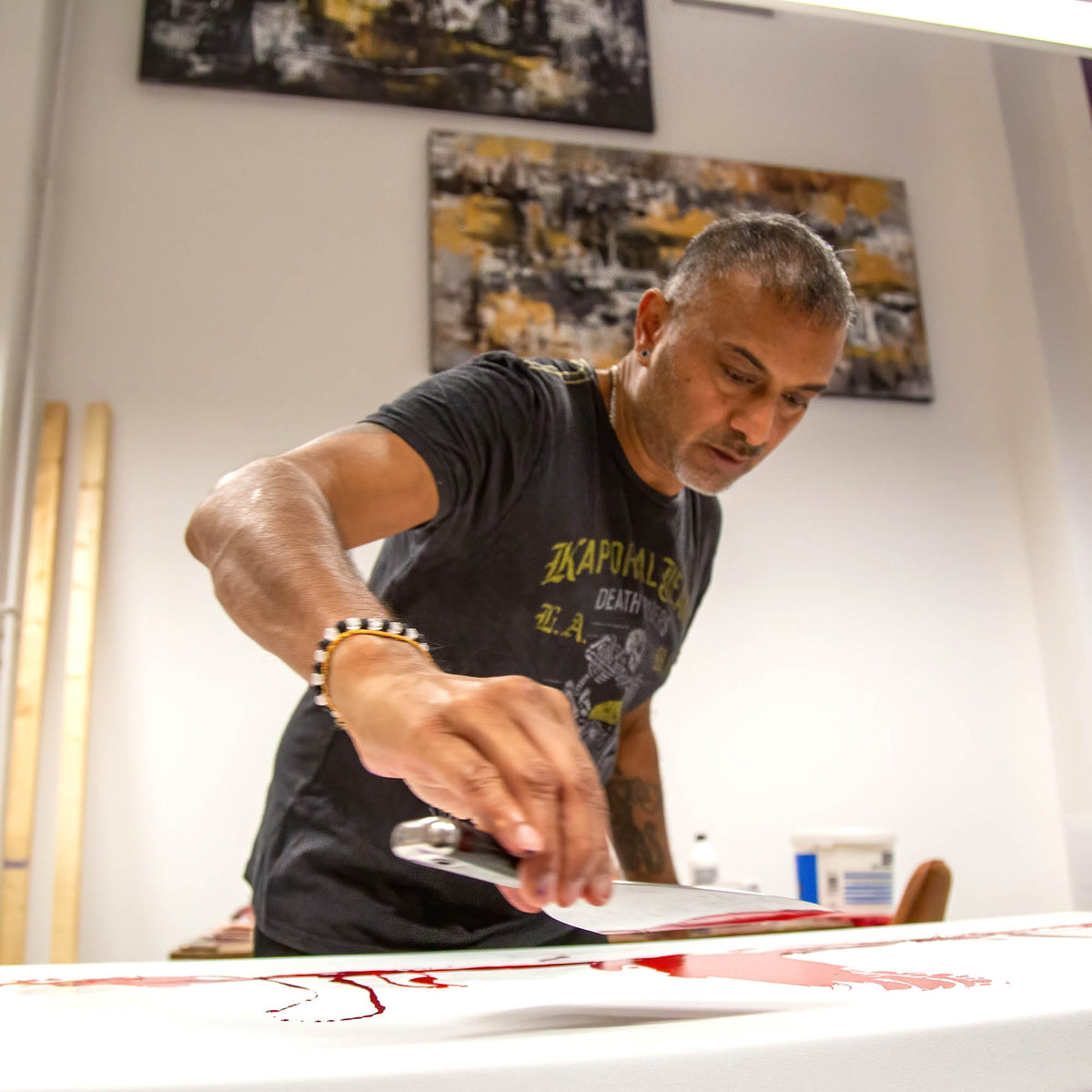
This Journal entry began with a film from an earlier pink and teal collection. The original recording remains here as a look back at the studio.
Share:
Kunst online kaufen