The journal / Colour and the home
A feeling for
colour.
We all have colours we return to. Some remind us of particular places. Others simply make a room feel more like our own.
Colour psychology can offer a useful starting point for interiors, but it is not a set of instructions. A thoughtful home begins with what you enjoy, the light you live in and the character you want to create.

01 / First, the research
What does colour psychology actually tell us?
Colour psychology explores the associations people make between colours, feelings and ideas. These associations are real, but they are not fixed emotional reactions. A particular shade does not guarantee that everyone who sees it will feel the same way.
A 2025 systematic review of colour and emotion research examined findings from 132 studies involving more than 42,000 participants. It found recurring colour–emotion associations, while also noting that such associations do not necessarily translate into changes in how people actually feel.
Culture, memory, lighting and surroundings all matter. For your home, colour psychology is best used as an invitation to notice your preferences, not as a promise that a chosen colour will produce a certain mood.
02 / Idea one / Begin with daily life
How do you want a room to feel when you use it?
Before choosing a colour, think about the room at the times you actually spend there. A living room used for relaxed evenings has different demands from a bright kitchen or an entrance hall that you pass through several times a day.
Ask what is already working. Perhaps the natural light is beautiful but the room feels a little bare. Perhaps your furniture is restrained and you would like one element with more character.
You may want a soft, understated backdrop, a confident focal point or something in between. There is no universal colour prescription. The right decision depends on the room and the people who live in it.
03 / Idea two / Think beyond hue
Do lightness and intensity change how colour feels?
Two shades from the same colour family can create very different impressions. A pale, muted blue has a different visual presence from a deep, saturated blue. Warm cream and dark ochre may share an underlying warmth, yet they occupy space differently.
Notice lightness, meaning how light or dark a colour appears, and saturation, meaning how vivid or subdued it is. These qualities help explain why simply deciding that a room should be green, pink or red does not tell you enough.
Test colours in the actual room during the day and after dark. Natural light, lamps, timber, textiles and surrounding wall colours can change how a shade appears.

04 / Idea three / A warmer note
How can warm colours bring character to an interior?
Amber, terracotta, rust and gold are often associated with warmth. In a room, they can provide a pleasing counterpoint to cooler stone, grey upholstery or dark timber. The effect depends as much on the proportions and materials around them as on the colours themselves.
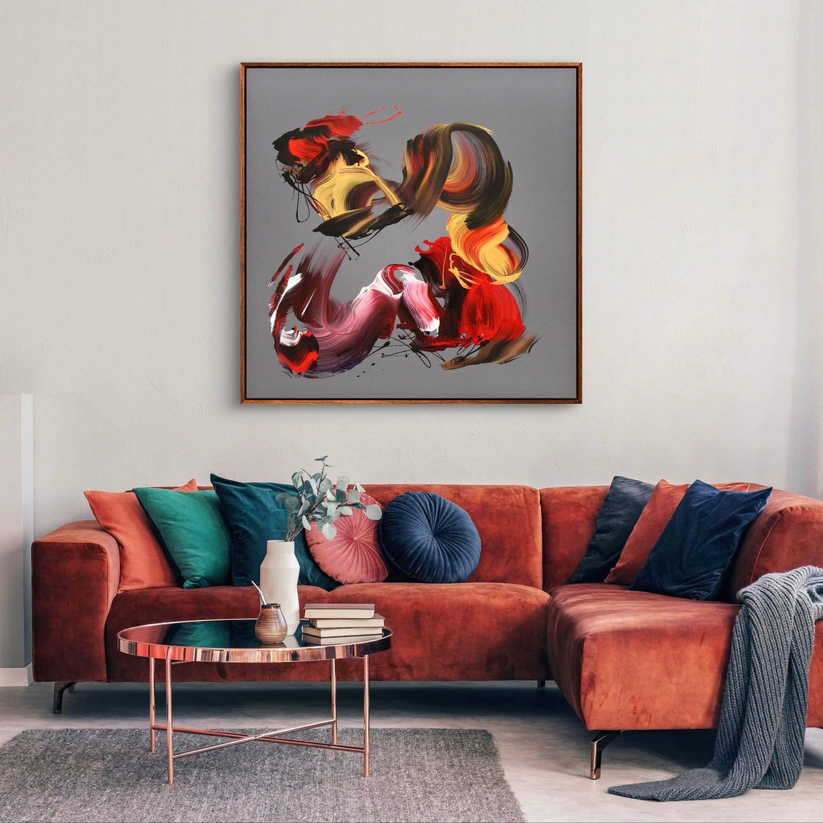
Autumn Breeze II moves between amber, rust and gold with softened grey and charcoal. Its colour feels rich without requiring the rest of the room to follow the same palette.
An original painting can introduce warm notes in a considered way. You might respond to its gestures, its palette or the contrast it brings to the furnishings you already own.
05 / Idea four / Create contrast
Can a darker palette make a room more interesting?
Colour psychology is often reduced to advice about bright shades and cheerful rooms. Dark tones deserve equal consideration. Black, charcoal and deeper colours can create contrast, give lighter surfaces definition and make individual objects easier to notice.
Chromatic Symphony combines black, white, grey and red in sweeping layers. The darker marks bring depth, while the lighter passages stop the composition from feeling closed in.
Not every corner needs to be bright. A dramatic work can be particularly compelling where the architecture and furniture have a simpler, quieter presence.


06 / Beyond the familiar rules
Do blue and green always make a room feel calm?
Blue and green are often linked with lower-energy, positive associations in colour research. But an association is not a guarantee of calm. Saturated turquoise, for example, can feel lively and expressive, while a soft grey-blue can read quite differently.
Blue Awakening moves through deep blue, turquoise and white with fluid gestures that suggest air and water without illustrating a literal scene. Its sense of movement is as important as its palette.
Choose these colours because you enjoy their particular character, not because a colour chart says they must relax you.
07 / The complete composition
Can several strong colours work beautifully together?
Yes. Colour becomes more interesting when it is considered in relation to what sits beside it. Contrasts between dark and light, cool and warm, or intense and muted can create an absorbing composition rather than visual noise.
Symphony of Colour brings teal, emerald green, blue and white into a large original painting with confident, flowing movement. Its softer areas allow the more energetic gestures to breathe.
In a room, the same principle applies. Let the painting have space around it, rather than trying to repeat every colour in cushions, rugs and accessories. A thoughtful interior does not need to announce its palette in every detail.

08 / Personal taste first
How do you choose artwork colours you will enjoy for years?
Look at the whole painting rather than a list of colours. Two works with similar palettes may feel completely different because of their movement, balance and painted surface. Spend time with the details that first caught your attention.
Check the actual dimensions, orientation and close-up photographs of an original canvas. An in-situ image helps you imagine a painting in your home, but the measurements and artwork photographs tell you more about the work itself.
If you are drawn to a painting, you do not need a psychological explanation for that choice. You can explore original abstract paintings, read our guide to colour in interior design, or contact the studio about a particular piece.
A final thought
There is no correct colour for a beautiful home.
The most considered interiors are not built from rigid rules. They develop through an understanding of light, proportion, materials and the things you genuinely love. Colour should be part of that conversation.
Explore original paintings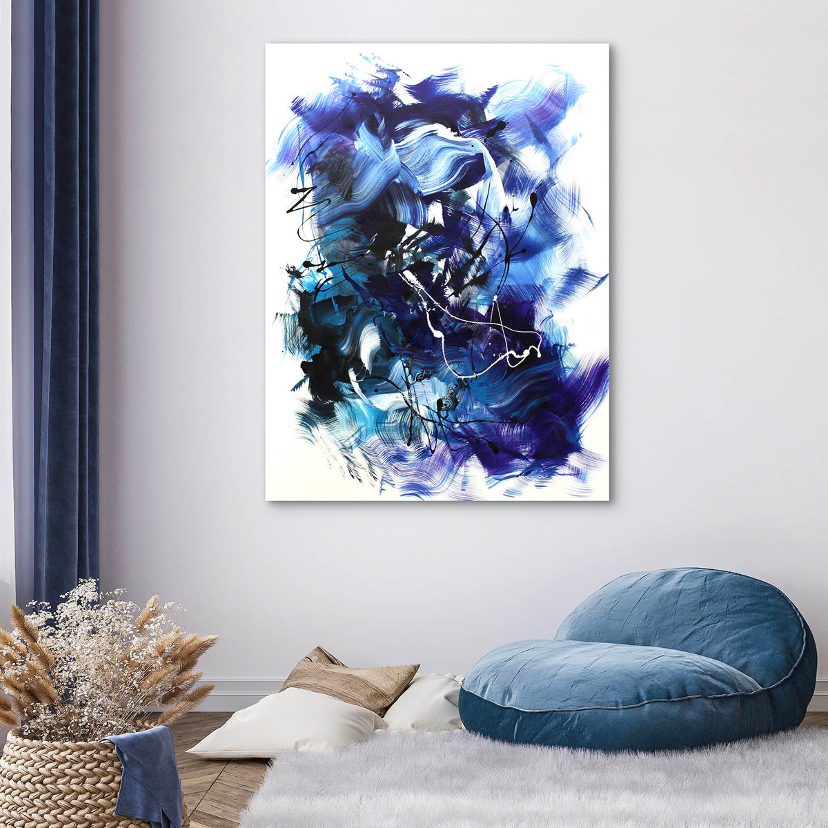

Share:
Buying Original Art Online | A Considered Guide
Art and the Brain | Why We Keep Looking