The journal / Colour and interiors
Mocha Mousse
& Abstract Art
Warm brown, soft taupe and a little contrast. Mocha Mousse shows how a quiet colour can still have plenty of character.
Chosen as Pantone's Colour of the Year for 2025, PANTONE 17-1230 Mocha Mousse is an earthy brown. Its appeal goes beyond any single year, particularly when used alongside original abstract art.

01 / The colour
What is Pantone Mocha Mousse?
Mocha Mousse is a warm brown with a soft, understated appearance. Pantone selected it as its Colour of the Year for 2025. Think of coffee, cocoa and natural materials rather than a strong or glossy brown.
It works as a neutral alongside original art without demanding that the painting match the wall. You can see the official colour reference on Pantone's 2025 colour page.
These examples are inspired by the same warm colour family. They are not presented as exact Pantone colour matches.
02 / Colour pairings
Which colours work with Mocha Mousse?
Cream, ivory and soft white keep a room feeling light. A brown-toned painting can add depth against pale walls without overwhelming them.
Stone, taupe and warm grey make an easy, layered combination. A work with movement or texture prevents a neutral room from feeling too uniform.
Charcoal, rust and amber give the palette more contrast. They work especially well when there is dark timber, brass or natural linen nearby.
Rather than matching every accessory, try picking up one or two colours from a painting elsewhere in the room.
03 / An original painting
A warmer way to use abstract art
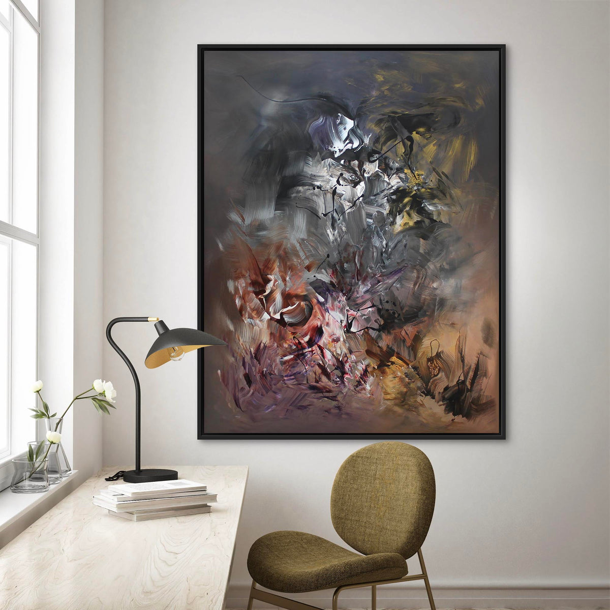
In Mocha Symphony, earthy colours travel across the canvas in expressive layers. There is plenty of movement, so it can bring energy to a restrained interior while sitting comfortably alongside brown and taupe furnishings.
A painting does not need to reproduce the exact wall colour. A related tone can be enough to make the artwork feel connected to the room.
PANTONE 17-1230
MOCHA MOUSSE
Approximate on-screen colour impression only. Refer to Pantone for the official colour standard.
04 / More contrast
Mocha tones with rust and grey
Autumn Breeze II brings amber, rust and warm grey into the mix. The colours are richer than Mocha Mousse itself, but they sit naturally beside brown, stone and wooden furniture.
If a room is very neutral, a painting like this can introduce warmth and movement without requiring a complete redesign.


05 / A softer approach
When you want something quieter
Precious Memories I uses a more restrained palette of taupe and softer tones. It works particularly well with pale walls, natural fabrics and simple furniture.
The composition gives the room an individual touch without relying on strong colour. For some spaces, that is exactly what is needed.
06 / Choosing art
How do you choose abstract art for a mocha-toned room?
Look first at the painting itself. Do you prefer bold brushwork or a quieter composition? Then consider how its colours sit with your walls, furniture and flooring.
Scale matters. A generous canvas can become the focal point above a sofa, while a smaller piece may be better suited to a hallway or more intimate room.
Finally, check the painting in daylight and under your evening lighting. Warm neutrals can shift quite noticeably. Choose a work you enjoy living with, not simply because it happens to fit a colour trend.
A final thought
Colour is a starting point.
Mocha Mousse may have been a Colour of the Year, but warm neutrals are not limited to one season. Original art brings something more personal: the colour, movement and character of a painting you have chosen for yourself.
Explore original paintings →
Share:
Beyond the Canvas | A Collaboration with Winch Design
Colour and Emotion | Living with Abstract Art