The journal / Colour and emotion
Colour changes
everything.
One painting can make a room feel warm and lively. Another, in softer colours, can give the same space a completely different atmosphere.
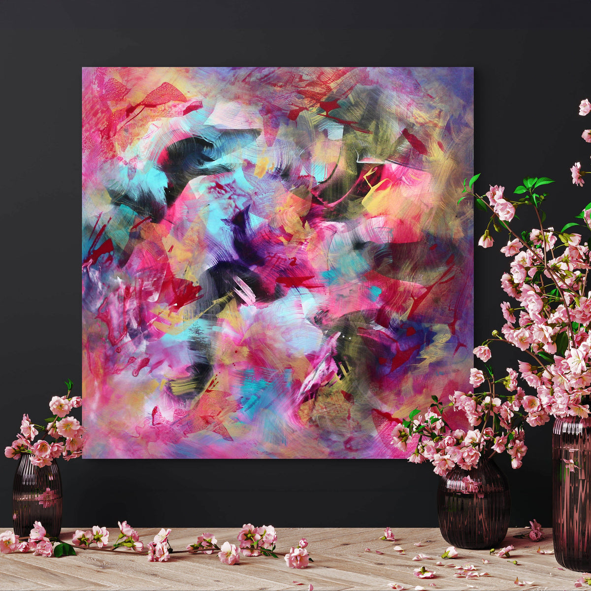
That is part of the pleasure of living with abstract art. You don't need to recognise a subject to respond to the colours, brushstrokes and movement on the canvas.

01 / Colour and feeling
Why does colour affect how we experience a painting?
Our response to colour is personal. Memories, culture, taste and the light in a room all play a part. There is no fixed rule that blue makes everyone feel calm or red makes everyone feel excited.
What we can see is how colours work together. Deep tones alongside white create contrast. Several similar shades can feel gentler, while brighter colours together often give a painting more energy. The size of the canvas and the movement of the brushstrokes matter just as much.
02 / Blue and turquoise
The quieter side of blue and green
Blue, turquoise and green often work well with stone, cream, pale timber and warmer neutrals. A painting in these colours can add freshness without making a room feel cold, particularly when there are softer tones within the composition.
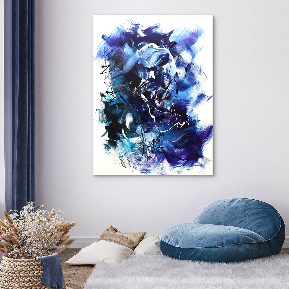
In Blue Awakening, the variation in blue and the movement across the canvas give the painting its character. It makes a strong focal point without needing much else on the wall.


03 / Red and gold
When colour brings warmth and energy
Reds, rust, amber and gold can add warmth to a neutral interior. They also sit comfortably with darker wood, soft grey and black details.
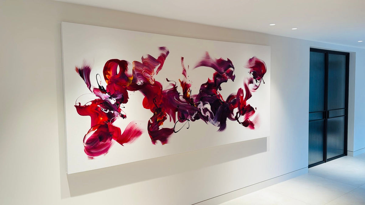
The effect depends on the painting. In Fiery Symphony III, rich red tones and expressive brushwork give the work a strong presence. It is a piece that can hold its own on a generous wall.
04 / Softer palettes
Subtle colour can be just as interesting
Muted greens, taupe, grey and soft neutrals can hold your attention as much as brighter colours. When a painting uses a gentler palette, the small differences between tones become more noticeable.
Fields Of Serenity shows how green can have depth without overpowering a space. It sits naturally with simple furniture and a light interior, allowing the painting itself to be the focus.

05 / Art in the home
How do you choose the right colours for your room?
Start with the painting you are drawn to, then think about where it will hang. Consider the natural light, the furniture beneath it and how much space you have around the canvas. You may want the artwork to be the main feature, or you may prefer something that sits more quietly with the room.
Colours don't need to match your furniture exactly. Sometimes one shade that connects with a cushion, rug or piece of furniture is enough. At other times, a contrasting painting is what makes the room more interesting.
If possible, look at the painting in daylight and in the evening. The colours can appear quite different, and that can help you decide whether the work feels right for your space.
06 / The artist
How Paresh Nrshinga uses colour
Paresh Nrshinga FRSA is a London-based contemporary abstract artist. His paintings range from vibrant, energetic compositions to quieter works with softer colours and more restrained movement.
Colour is central to his work, but so is the way it is applied. Layers of paint, contrasts and expressive brushstrokes give each original painting its character. The choice is less about what a colour is supposed to mean and more about how the finished painting feels to the person looking at it.
A final thought
Choose what you love.
There is no single right colour for a home. The best abstract painting is one you enjoy looking at, whatever its palette. If it keeps catching your eye, that's a good place to start.
Explore original paintings →
Share:
Mocha Mousse & Abstract Art | Warm Neutrals for Interiors
Living with Teal | Abstract Art for Modern Interiors