The journal / Colour and interiors
Living with
Teal
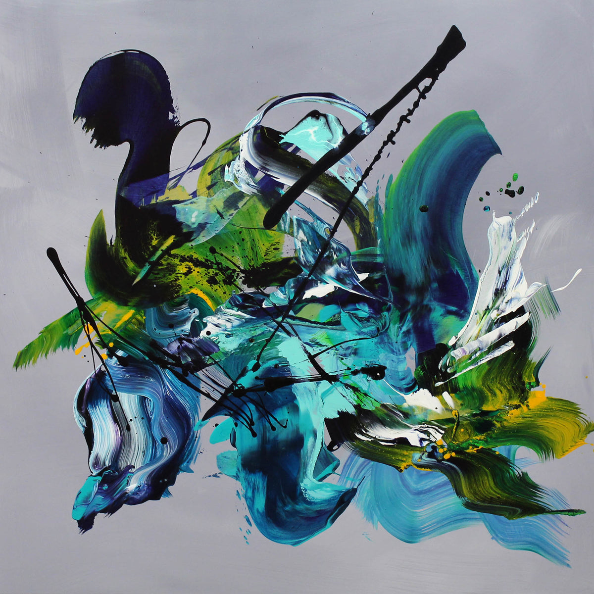
Teal sits somewhere between blue and green. In an abstract painting, it can bring freshness, depth or a quieter note to a contemporary room.
You don't need teal walls or matching furniture to make it work. Often, one well-chosen artwork is enough to bring a room's colours together.

01 / A versatile colour
Why does teal work in modern interiors?
Teal has the richness of green and the openness of blue, which makes it surprisingly easy to introduce into a neutral home. A pale, blue-led teal can feel airy. Deeper emerald and turquoise tones give a painting more presence.
How a colour feels is personal, and lighting makes a difference too. Rather than relying on colour psychology rules, look at how the artwork works with the textures, furniture and natural light already in your room.
02 / Palette
Which colours go well with teal artwork?
Warm whites, stone and taupe. These are an easy starting point. They soften the contrast and allow teal, turquoise or blue to stand out without competing with the rest of the room.
Natural wood and muted brown. Oak, walnut and warmer earthy tones bring warmth alongside cooler greens and blues.
Charcoal, black and soft metallics. Dark details can give a teal painting definition, while restrained brass or bronze accents work well with richer compositions.
A painting doesn't need to match every cushion or accessory. It often looks better when its colours are connected to the room in a more subtle way.
03 / Placement
Where should you hang teal abstract art?
Living room. Try a generous painting above a sofa or on the main wall where its colour and movement can be enjoyed from across the room.
Bedroom. Softer blue-green artwork works well with natural linen, warm white walls and simple furniture, without requiring a completely blue or green colour scheme.
Home office or hallway. A strong painting can give an otherwise functional space personality. Choose a size that suits the wall rather than filling every available centimetre.
Before you decide, look at the artwork in daylight and with your evening lighting. Both its colours and the atmosphere of the room can change quite noticeably.
04 / Choosing art
How do you choose the right teal painting?
Start with the painting itself. Are you drawn to an energetic composition with broad brushstrokes, or something softer and more layered? A large piece with strong movement will have a different presence from a quieter painting in similar colours.
Think about the wall, the furniture below it and the space you have around the canvas. Give the work room to breathe. It should feel at home in the interior, rather than being chosen simply to fill a gap.
Above all, choose a painting you genuinely like. The best reason to live with original art is that you enjoy looking at it every day.
Original paintings / Paresh Nrshinga FRSA
Teal, turquoise and blue in the collection
These original abstract paintings show how differently the same colour family can be used. Each has its own composition and character.

Soft blue and turquoise in a contemporary setting.

A richer mix of teal and blue with expressive movement.
A final thought
Let the art lead.
A teal painting can be bold, subtle, fresh or atmospheric. The important thing isn't to follow a formula. It's to find a piece that feels right for you and gives the room something individual.
Explore original paintings →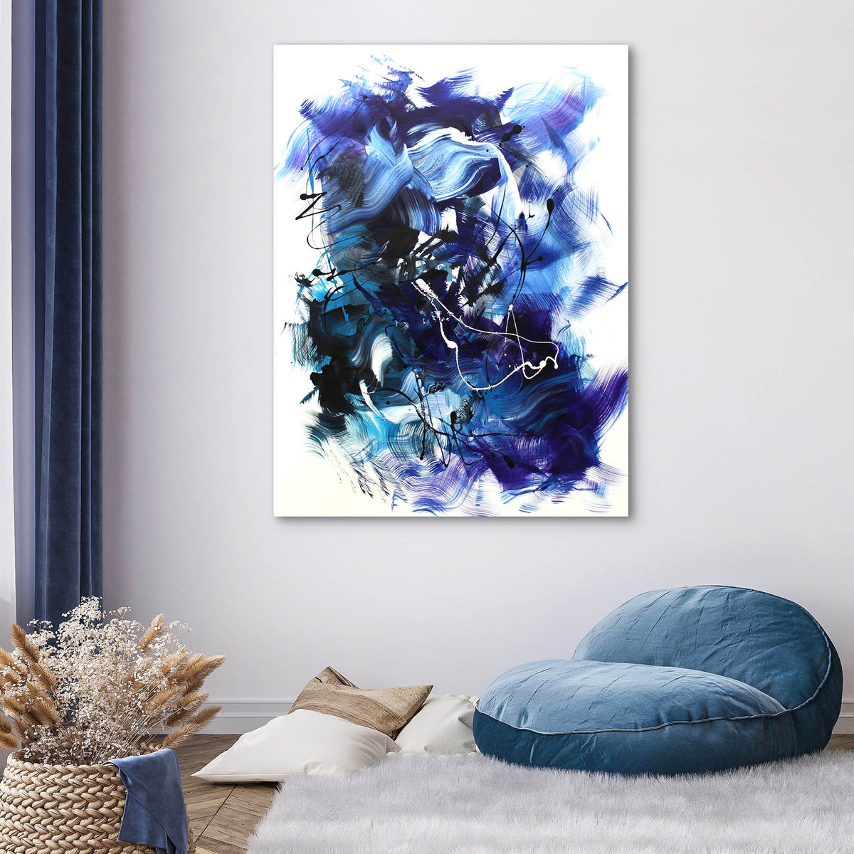

Share:
Colour and Emotion | Living with Abstract Art
A Note from the Studio | Paresh Nrshinga